Presentation Tip: Show steps in a process
When you need to explain a process, whether it is a manufacturing process, process for handling expense claims, or process for installing a new system, there are steps you want to walk the audience through. The default template in PowerPoint leads many presenters to use a numbered list of steps: step one through to the final step. In today’s tip I want to show you some examples of visuals that can show a process better than a numbered list.
Linear process with same type of activity
The first example is for a linear process where each step is the same type of activity. Here is an example.

Each step in this example is handled by the same department and in the same location. When the audience sees the same shape used for each step, they draw a conclusion that each step is the same type of activity. Use this type of diagram when you have a simple process that does not include different types of activities.
Linear process with different types of activities
When it is important for the audience to immediately see that there are different types of activities in the process, use a diagram like this example.

The different shapes indicate the three types of activities: design, coding, and testing. When you create these types of process diagrams, you can see how adding an icon that represents the type of activity makes it even easier for the audience to understand the diagram.
Continuous processes
Not all processes are linear. Continuous improvement processes are one of the most common types of processes that do not really ever end. Once the cycle is complete, it starts again. Here is an example.

Creating a circular diagram in PowerPoint is easiest if you use the drawing tools instead of the built-in SmartArt diagram tool. I find the SmartArt circular process diagram hard to work with, hard to customize and difficult to get looking exactly the way you want. The type of circular diagram above is easier to create and allows you to include as many steps as you need.
Your audience will appreciate you using diagrams instead of a list of steps when explaining processes. You do not need any fancy software to create these diagrams. The examples above were created in PowerPoint using the drawing tools that everyone has in the software. You may need to brush up on the use of these tools, but you can soon be creating your own process diagrams for your presentations.
Presentation Tip: Ideas from the 2013 Presentation Summit
Every year when I speak at and attend the Presentation Summit conference I come back with great ideas from other presentation experts that I can adapt or use in my own presentations. Last month the conference was in Ft. Lauderdale, FL and in this article I want to share three ideas I picked up at the conference.
The first idea came from Nolan Haims (www.PresentYourStory.com). He showed us a bullet graph, a type of graph created by noted visual expert Stephen Few. This is what a bullet graph looks like. 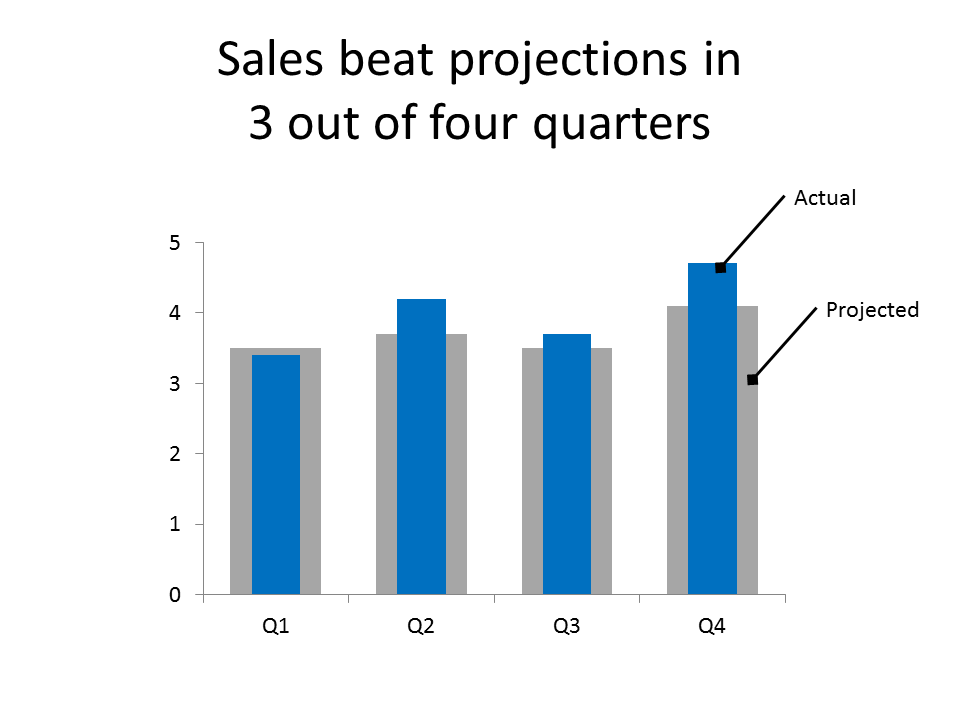
What I liked about this type of graph is that it is a good substitute for a two series column graph when you want to compare values that are related. The example above is a good illustration of this as the projected value and actual value are related information. Instead of two columns side by side where the audience has to work to determine the difference, the bullet graph shows the comparison on top of each other. This makes it easier for the audience to instantly understand whether the actual value is greater than or less than the projected value. While this is not a built-in graph type in PowerPoint, it is possible to create this graph in PowerPoint by placing the second series on a second axis and making each column a different width.
The second idea came from an Entrepreneur’s roundtable session that I moderated. One of the big issues for people trying to make a change to the presentation culture in an organization is the phrase, “It’s good enough.” Change doesn’t happen unless someone recognizes the value of that change. If the decision makers don’t see the problem as big enough, they won’t pay for a solution. When it comes to presentations, we need to look at the cost of presentations in organizations. There are costs of people spending more time creating presentations than they should because they haven’t been given the training they need. There is the cost of poor presentations that result in rework to get a decision made. I created an online calculator as part of this article that will quantify the dollar cost of presentations that require rework. And there are the hidden costs of sales not made or productivity gains not realized because the audience was confused or not convinced to take action. When totalled, these costs can easily run into the hundreds of thousands of dollars. If you want to change the presentation culture in your organization, quantify these costs and present that large dollar figure to your boss. Now they may be willing to solve the problem with the type of customized training and other resources I provide to my clients.
The third idea came from the now annual Pecha Kucha session hosted by Ric Bretschneider. Two of the participants giving example presentations used slides that were full screen images. One participant had a headline on each slide, and one did not. What I found fascinating while watching the two presentations, is how the slides without headlines kept me more intrigued as to what the presenter was going to talk about. I advocate using a headline for your slides, but this observation got me thinking in a new direction. I still think that having headlines is important in corporate presentations, especially those that will be distributed later via e-mail. I am now thinking that in certain cases where you really need to grab attention with a full screen image, consider revealing the headline after you have explained the key point. You continue to talk about the point after the headline appears on the slide, but you have taken advantage of the intrigue the audience feels before you r eveal the key point. This isn’t something that you will use in every presentation, but it is another tool to put in your presentation toolbox.
I so appreciate those of you who attended the Presentation Summit and came up to me with kind words about this newsletter and the work that I do. If you want to learn more about the conference and join us next year in San Diego, check out www.PresentationSummit.com.
Insights from Audiences: Results of the 2013 Annoying PowerPoint survey
I recently wrapped up my latest survey of audience members on what annoys them about PowerPoint presentations. A total of 682 responses came in and the message for presenters is clear: A lot of you don’t understand how to create and deliver an effective presentation, and audiences are getting more fed up about it. In this article I will give you the highlights of the results and where you can find the detailed analysis and results on my website.
The first key insight from the survey is that presentations are becoming a more common form of communication. In the survey, 25.5% of respondents said that they see, on average, one or more PowerPoint presentations each day. This number has increased from 13.4% in 2007, to 14.2% in 2009, to 19.7% in 2011, and now 25.5%. This is an almost doubling in the number of people seeing at least one presentation per day in the last 6 years, an average growth rate of 15% per year over that time.
Many of my clients are telling me that almost every meeting has a PowerPoint presentation and reports and memos are being replaced by presentations. Does it make sense that so much of communication in organizations is shifting towards presentations? Not necessarily. As the write-in comments showed, more people are recognizing that their time is being wasted with presentations that really should have been written documents e-mailed for everyone to read.
In the survey I give people a choice of twelve things that can annoy an audience member about a PowerPoint presentation and ask them to select the top three. The number one annoyance, and the top three annoyances have not changed since the last survey. Here are the top three, with what percentage of respondents included them in their top choices.
The speaker read the slides to us 72.0%
Text so small I couldn’t read it 50.6%
Full sentences instead of bullet points 48.4%
The percentages did not change much from the last survey two years ago. Reading the slides to the audience is still the most annoying thing a presenter can do, by a wide margin. The next two answers switched spots from the last survey. In second place, using text that is too small to comfortably read was cited by over half the respondents. It continues to amaze me what font size some presenters use on their slides. One of my clients has set the record for me in terms of smallest font I have seen used on a slide – 4 point! As I explain in my workshops, “if you ever hear yourself say, “I know you can’t read this,” just turn off the projector”. As the survey clearly indicates, you are annoying the audience by using text they can’t read. In third place was using full sentences instead of bullet points for text. Full sentences encourage reading, which leads to the most annoying thing a presenter can do.
In this survey, I asked respondents to write in three words or phrases (positive or negative) they commonly hear in their organization about PowerPoint presentations. I took all the words and phrases, excluded some common nouns, and created a word cloud to show the most common descriptive words the respondents used.
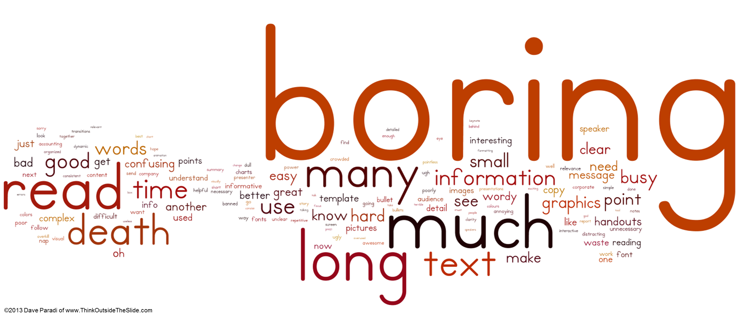
Boring stands out far above any other word. Why are audiences bored? Because they don’t understand the message and feel they are wasting their time. I don’t think that boring refers to the presenter not having content that the audience wants or needs to hear. The audience wants to hear the information, but it is so poorly organized and presented, that the audience gives up trying to figure it out and decides that this was a waste of their time. Often it is because the presenter didn’t take time to decide what the core information was, and just does a “data dump” presentation.
The issue of information overload is reinforced with the prominence of words such as long, much, and many. Too much information is being included in presentations, information that is not helpful to the audience understanding the message. In my workshops and my latest book, Present It So They Get It, I share five strategies for reducing information overload. This is always one of the most commented on sections of my workshops. Presenters need to learn how to pare down the information they have and create a focused message for the audience.
I have many more thoughts and insights from the survey, and you can read the full report on my website here.
So what is the overall message presenters, whether they are analysts, professionals, managers, or executives, should take from the responses to this survey? It is clear that presentations are becoming more popular as a vehicle for communicating ideas. With this increased emphasis, the expectations of the audience have increased. They are no longer satisfied with mediocre slides and poor delivery. Presenters need to improve their skills in planning their message, creating slides that support that message, and delivering those slides effectively. The result will be improved sales, increased efficiency, and faster decisions.


