Insights from Audiences: Results of the 2013 Annoying PowerPoint survey
I recently wrapped up my latest survey of audience members on what annoys them about PowerPoint presentations. A total of 682 responses came in and the message for presenters is clear: A lot of you don’t understand how to create and deliver an effective presentation, and audiences are getting more fed up about it. In this article I will give you the highlights of the results and where you can find the detailed analysis and results on my website.
The first key insight from the survey is that presentations are becoming a more common form of communication. In the survey, 25.5% of respondents said that they see, on average, one or more PowerPoint presentations each day. This number has increased from 13.4% in 2007, to 14.2% in 2009, to 19.7% in 2011, and now 25.5%. This is an almost doubling in the number of people seeing at least one presentation per day in the last 6 years, an average growth rate of 15% per year over that time.
Many of my clients are telling me that almost every meeting has a PowerPoint presentation and reports and memos are being replaced by presentations. Does it make sense that so much of communication in organizations is shifting towards presentations? Not necessarily. As the write-in comments showed, more people are recognizing that their time is being wasted with presentations that really should have been written documents e-mailed for everyone to read.
In the survey I give people a choice of twelve things that can annoy an audience member about a PowerPoint presentation and ask them to select the top three. The number one annoyance, and the top three annoyances have not changed since the last survey. Here are the top three, with what percentage of respondents included them in their top choices.
The speaker read the slides to us 72.0%
Text so small I couldn’t read it 50.6%
Full sentences instead of bullet points 48.4%
The percentages did not change much from the last survey two years ago. Reading the slides to the audience is still the most annoying thing a presenter can do, by a wide margin. The next two answers switched spots from the last survey. In second place, using text that is too small to comfortably read was cited by over half the respondents. It continues to amaze me what font size some presenters use on their slides. One of my clients has set the record for me in terms of smallest font I have seen used on a slide – 4 point! As I explain in my workshops, “if you ever hear yourself say, “I know you can’t read this,” just turn off the projector”. As the survey clearly indicates, you are annoying the audience by using text they can’t read. In third place was using full sentences instead of bullet points for text. Full sentences encourage reading, which leads to the most annoying thing a presenter can do.
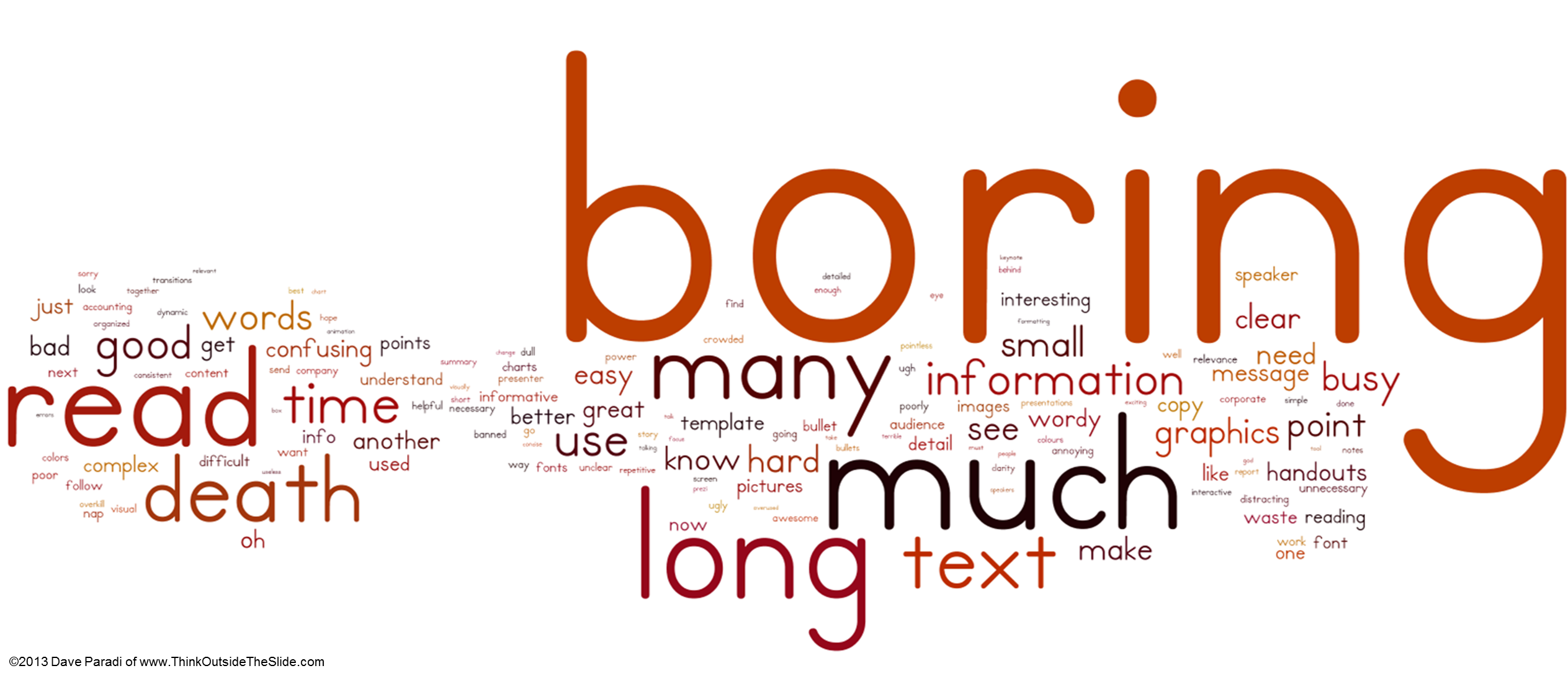
In this survey, I asked respondents to write in three words or phrases (positive or negative) they commonly hear in their organization about PowerPoint presentations. I took all the words and phrases, excluded some common nouns, and created a word cloud to show the most common descriptive words the respondents used.

Boring stands out far above any other word. Why are audiences bored? Because they don’t understand the message and feel they are wasting their time. I don’t think that boring refers to the presenter not having content that the audience wants or needs to hear. The audience wants to hear the information, but it is so poorly organized and presented, that the audience gives up trying to figure it out and decides that this was a waste of their time. Often it is because the presenter didn’t take time to decide what the core information was, and just does a “data dump” presentation.
The issue of information overload is reinforced with the prominence of words such as long, much, and many. Too much information is being included in presentations, information that is not helpful to the audience understanding the message. In my workshops and my latest book, Present It So They Get It, I share five strategies for reducing information overload. This is always one of the most commented on sections of my workshops. Presenters need to learn how to pare down the information they have and create a focused message for the audience.
I have many more thoughts and insights from the survey, and you can read the full report on my website here.
So what is the overall message presenters, whether they are analysts, professionals, managers, or executives, should take from the responses to this survey? It is clear that presentations are becoming more popular as a vehicle for communicating ideas. With this increased emphasis, the expectations of the audience have increased. They are no longer satisfied with mediocre slides and poor delivery. Presenters need to improve their skills in planning their message, creating slides that support that message, and delivering those slides effectively. The result will be improved sales, increased efficiency, and faster decisions.
The first key insight from the survey is that presentations are becoming a more common form of communication. In the survey, 25.5% of respondents said that they see, on average, one or more PowerPoint presentations each day. This number has increased from 13.4% in 2007, to 14.2% in 2009, to 19.7% in 2011, and now 25.5%. This is an almost doubling in the number of people seeing at least one presentation per day in the last 6 years, an average growth rate of 15% per year over that time.
Many of my clients are telling me that almost every meeting has a PowerPoint presentation and reports and memos are being replaced by presentations. Does it make sense that so much of communication in organizations is shifting towards presentations? Not necessarily. As the write-in comments showed, more people are recognizing that their time is being wasted with presentations that really should have been written documents e-mailed for everyone to read.
In the survey I give people a choice of twelve things that can annoy an audience member about a PowerPoint presentation and ask them to select the top three. The number one annoyance, and the top three annoyances have not changed since the last survey. Here are the top three, with what percentage of respondents included them in their top choices.
The speaker read the slides to us 72.0%
Text so small I couldn’t read it 50.6%
Full sentences instead of bullet points 48.4%
The percentages did not change much from the last survey two years ago. Reading the slides to the audience is still the most annoying thing a presenter can do, by a wide margin. The next two answers switched spots from the last survey. In second place, using text that is too small to comfortably read was cited by over half the respondents. It continues to amaze me what font size some presenters use on their slides. One of my clients has set the record for me in terms of smallest font I have seen used on a slide – 4 point! As I explain in my workshops, “if you ever hear yourself say, “I know you can’t read this,” just turn off the projector”. As the survey clearly indicates, you are annoying the audience by using text they can’t read. In third place was using full sentences instead of bullet points for text. Full sentences encourage reading, which leads to the most annoying thing a presenter can do.
In this survey, I asked respondents to write in three words or phrases (positive or negative) they commonly hear in their organization about PowerPoint presentations. I took all the words and phrases, excluded some common nouns, and created a word cloud to show the most common descriptive words the respondents used.

Boring stands out far above any other word. Why are audiences bored? Because they don’t understand the message and feel they are wasting their time. I don’t think that boring refers to the presenter not having content that the audience wants or needs to hear. The audience wants to hear the information, but it is so poorly organized and presented, that the audience gives up trying to figure it out and decides that this was a waste of their time. Often it is because the presenter didn’t take time to decide what the core information was, and just does a “data dump” presentation.
The issue of information overload is reinforced with the prominence of words such as long, much, and many. Too much information is being included in presentations, information that is not helpful to the audience understanding the message. In my workshops and my latest book, Present It So They Get It, I share five strategies for reducing information overload. This is always one of the most commented on sections of my workshops. Presenters need to learn how to pare down the information they have and create a focused message for the audience.
I have many more thoughts and insights from the survey, and you can read the full report on my website here.
So what is the overall message presenters, whether they are analysts, professionals, managers, or executives, should take from the responses to this survey? It is clear that presentations are becoming more popular as a vehicle for communicating ideas. With this increased emphasis, the expectations of the audience have increased. They are no longer satisfied with mediocre slides and poor delivery. Presenters need to improve their skills in planning their message, creating slides that support that message, and delivering those slides effectively. The result will be improved sales, increased efficiency, and faster decisions.

2 Comments:
Hi Dave, I think we all have sat through enough presentations of too small of text. As much as the trend in professional circles continue to move away from verbose slides, I am still shocked by the people who haven't got the memo. Good info, I am looking over the results now. Regards.
Dan
@pptclasses
Dave, I just watched your talk from the Outstanding Presentations Workshop and it was... outstanding! To me, it was the best of the series to date.
I loved that your talk was a reasoned argument illustrated by slides – rather than just a series of seemingly random data dumps on the chosen topic, as happens in most business or academic presentations!
(By the way, one improvement I suggest is to crop the screenshot on the “How big your font needs to be” slide, so you can enlarge the table to almost fill the slide. The text in the screenshot isn’t readable and isn’t needed, so could be safely left out.)
Have you seen the recent video of Chris Anderson (curator of TED talks) where he says a talk needs to take people on a journey, step-by-step?
Well your webinar sure did that, with one clear message per slide, varied visuals, and lucid headlines instead of category names (like “Findings”) on your slides. So, well done on a great job!
Post a Comment
<< Home