Presentation Tip: Proportional Shape Comparison Diagrams
In February I launched a tool on my website that allows you to create diagrams like this: 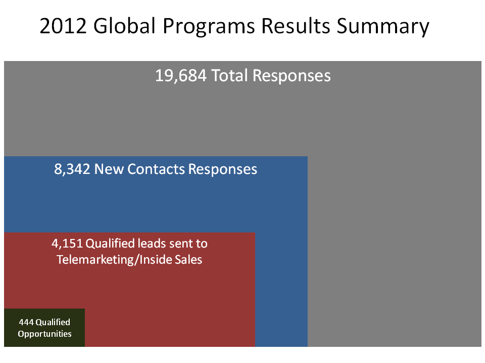
I refer to this type of diagram as a proportional shape comparison diagram because the size of the shapes allows the viewer to instantly compare the numbers each shape represents. These types of diagrams are popular in print media and are becoming popular in presentations. David McCandless uses a number of them effectively in his TED talk you can watch here.
I think these diagrams work better than a table of numbers because the numbers make the audience do the math to compare the amounts, which is especially hard when the numbers are different by an order of magnitude or more. These diagrams also work better than pie or column graphs because the smaller number almost disappears on the graph due to the graph being limited to measurement in only one dimension. A proportional shape comparison diagram gives you two dimensions to work with and allows smaller numbers to be more easily compared to larger numbers.
The challenge in creating these diagrams has been in doing the calculations. This type of diagram is not built into the PowerPoint graphing function, so you have to do the calculations by hand. To make it easier for you, I created an online tool that does the calculations for you. You simply input the large and small numbers you want the shapes to represent, and the tool will tell you the dimensions of the shapes. The tool calculates dimensions for side-by-side squares, overlapping rectangles (as shown above), and circles that can be side-by-side or overlapping that will fit in most corporate templates. You can also set the maximum dimensions to scale the shapes to fit your template.
Use of the tool is free on my website at www.ProportionalComparisonTool.com. There are examples of the type of diagrams you can create and detailed instructions on how to use the tool. Once you use the tool, you will find it quite easy to include this type of diagram in your own presentations. In the past few months I have used it to show comparisons of customer service contact methods, market penetration in a geographic area, components of the change in financial projections, the reduction in weight of glass containers, the narrowing of investment choices from the full market to those stocks selected for a portfolio, and the results of an e-mail marketing campaign. You can see by the breadth of these applications that this type of diagram can be used effectively in many presentations.
In February I had the opportunity to present this tool to the graphics developers at Microsoft and my fellow PowerPoint MVPs. Everyone thought it was very useful and my fellow MVP Glenna Shaw included it in two articles she wrote for the Microsoft Office Blog. You can see the first of the articles here. People realized that this type of diagram, which used to be only possible with many hand calculations, is now available to all presenters because the tool removes the barrier of the calculations.
Whenever you have to compare numbers that are at least an order of magnitude different, consider using my Proportional Comparison Tool to do the calculations that allow you to create a proportional shape comparison diagram. And pass this newsletter on to others who could improve their presentations by using this type of visual.
posted by Unknown at 8:19 AM
![]()

2 Comments:
Great tool, thanks so much for posting! This will be great for putting together my next presentation :)
Jared
http://artofpublicspeaking.net
Yes, I agree, very useful.
Post a Comment
<< Home