Thursday, March 20, 2014

April 10 workshop in Toronto on turning Excel data into visuals for executive presentations

Professionals who present financial or operational data say there are two key roadblocks to them using effective visuals instead of the spreadsheets, tables, and complex graphs they are currently using. First, they need to know what visuals work for the different messages they deliver. Second, they need to know how to create these visuals in PowerPoint.

My workshop on April 10 in downtown Toronto will show you how to overcome these roadblocks. You will see many different visuals from real presentations, and you will be hands-on in PowerPoint practicing the techniques that are used to create the visuals. The full details of all you will learn are on my website at www.MakeNumbersVisual.com.

Who should attend this workshop? Anyone who: 1) has to present financial or operational data in their presentations, 2) knows that there must be a better way than using spreadsheets on slides, and 3) is willing to learn new visuals that are more effective.

If you are in the Toronto area, plan to attend. You will walk away will skills that will make your next presentation more effective.


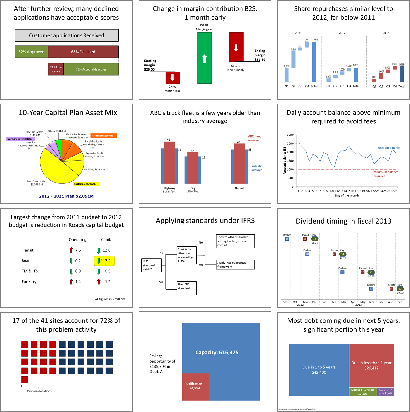
Here are some of the visuals you will learn how to create:

Tuesday, March 18, 2014

Presentation Insight: Numbers only measure a story

Why do presenters use so many spreadsheets and tables of numbers in their presentations? The answer I get from participants in my workshops is that the numbers and analysis are important. The audience needs to see all the numbers. In this article I want to explain why I think that the numbers are not as important as presenters think they are.

What are the numbers really? They are measurements of something going on in the organization. It could be sales, inventory, shipments, headcount, square footage, or any of the literally thousands of things that get measured in every organization today. And by themselves, they don't mean much.

What we do is we compare the measured values to some desired state, such as last year's number, a budget amount, a projection, an industry average, or other relevant number. Why do we do the comparison? Because we want to get a sense of whether the measured value indicates good or poor performance. So are these the numbers that are important? Not yet.

Here is the key I want you to understand. Numbers, whether measured or derived from analysis, only measure an underlying story of what is going on in your organization. Your audience wants to know that story, not the numbers. This is a fundamental shift in thinking for many professionals who present financial and operational data. Only include numbers when they are used as support for the story you are sharing. Don't think that the numbers are the story, because they aren't.


In a workshop last year I observed that the slides the participants were using each week to report to management contained lists of the breakdown of sales into categories and whether those were favorable or not compared to the budget. The numbers weren't even in tables, they were incorporated in bullet points of text so that the executives had to hunt to find them. Not effective at all.

Here is the question I asked that group to consider when deciding whether to include a number on a slide: "Is the situation these numbers describe important enough that action is necessary?" If not, don't include the number. The executives don't care about the number. They care about whether it indicates a situation they need to make a decision on. If it doesn't require a decision, leave it out of the presentation.

When you take the perspective that the numbers are not as important as the story they are telling, you actually end up changing the analysis you do. You become more focused on creating a message supported by the analysis. And when you want to tell that story visually, you can create effective visuals from the numbers. That's why I launched the What Visual To Use site to help you select the best visual for the message your numbers are telling. If you want to join me in Toronto or Denver to learn how to create visuals that work for financial data, register for my hands-on workshop.

Tuesday, March 04, 2014

3 Big Mistakes professionals make when presenting financial or operational data to executives

Do you present financial or operational data to executives? Make sure you aren't making these three mistakes.