Presentation Insight: Using Amazon Storybuilder to outline a presentation
Late last year Amazon Studios introduced a tool that will be helpful for presenters. Amazon Studios is a movie studio that helps produce films for film makers. How would their tools relate to presentations? Like the stories that film makers tell, our presentations should tell a story. In this article I want to share how I think the new Amazon Storybuilder can help you outline the content for your story.
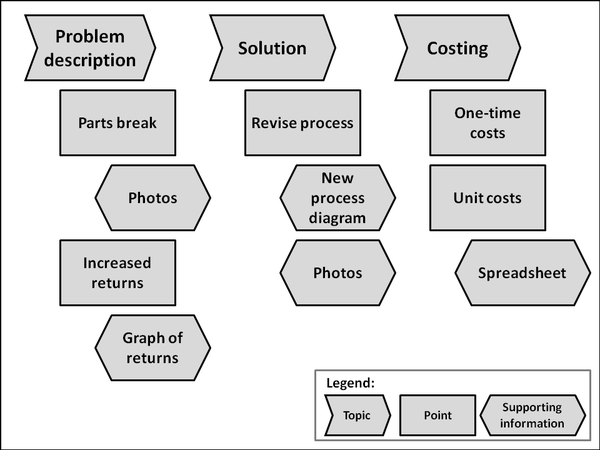
In my workshops I always share my six step RAPIDS approach for planning your message. The P in the RAPIDS acronym stands for Presentation Outline. I show the participants how outlining your message with hierarchically arranged sticky notes is a great way to see the entire message at once. You may also have seen this in the seven day e-course that I offer new newsletter registrants. Here is the example I use in my workshops and the e-course:
Up to now, there has been no easy online way to create these types of outlines. The Amazon Storybuilder tool (at http://studios.amazon.com/storybuilder) may be a great answer to this challenge. It is an entirely web-based tool that is accessible from any platform and any browser. I have used it on my laptop and my iPad quite easily. All you need is a free Amazon account (you can use the one you are already using to buy books if you want).
The concept is that you create a corkboard and pin cards to it, similar to sticking sticky notes to a wall or whiteboard. You create a new corkboard for each presentation. The topics you want to cover in your presentation are the highest level of your presentation outline. In Storybuilder, the top level of the story are referred to as Groups, so you would add each topic as a Group at the top of the corkboard.
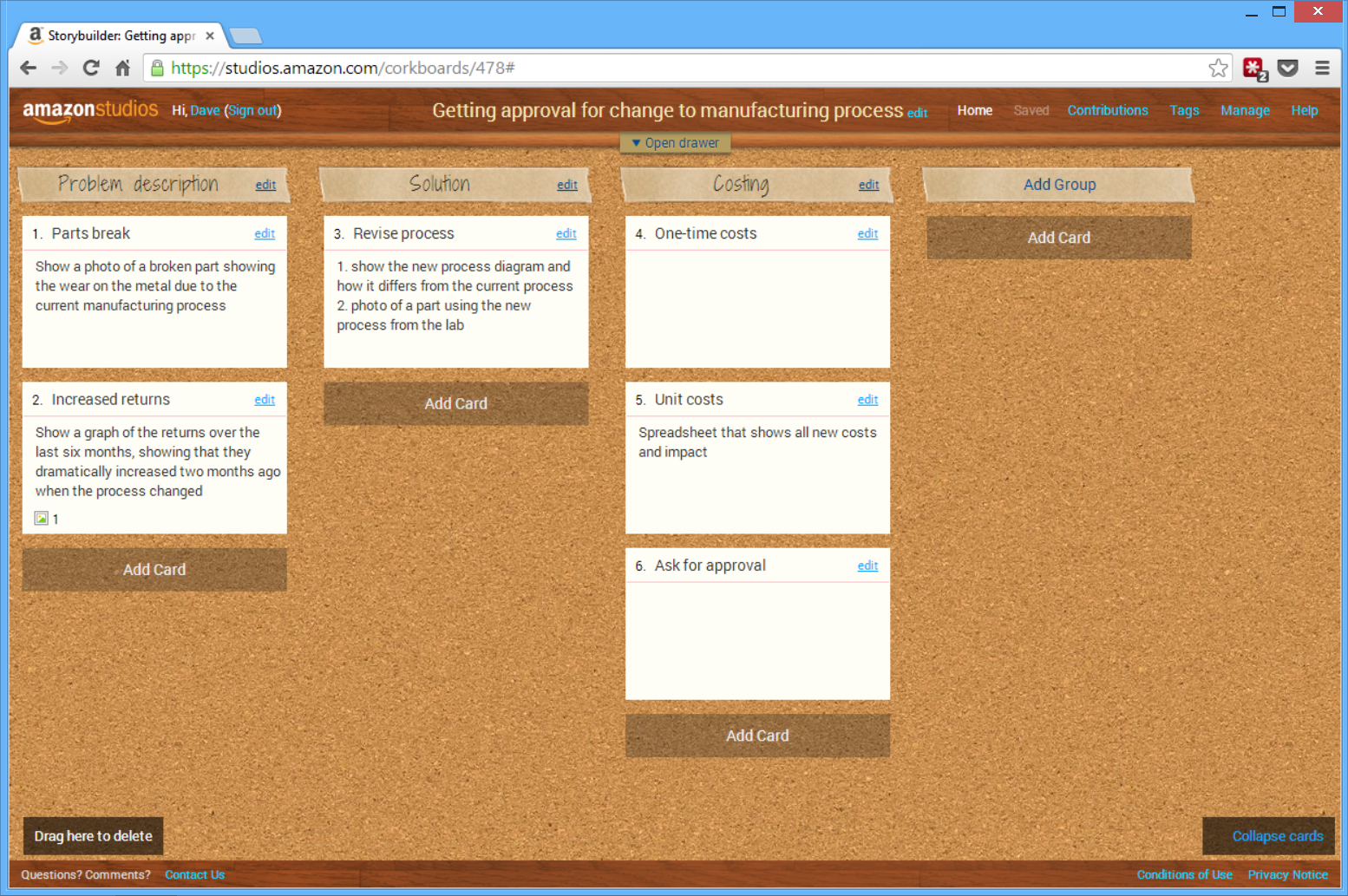
Under each Group, add a Card for each point you will make when discussing that topic. The Card has a title, which you can use to describe the point. In the description for the Card, add what supporting information or visual you will use to illustrate this point, such as a graph, photo, etc. You can even add an image to each Card if you want to sketch out the visual. I did this recently in an airport lounge. I drew a graph on a napkin and took a photo on my iPad when adding an image to the Card. You access the image feature by double clicking on the card to make it larger and show the additional options.
Just like cards on a corkboard or sticky notes on a wall, you can use your mouse to rearrange the cards on your corkboard, making it easy to move points between different topics if needed. You also see the whole corkboard on your screen, which allows you to see the whole presentation at the same time, so you can make sure you have included everything you wanted to say.
The tool will also allow you to invite collaborators to help work on the outline. They only need a free Amazon account to view and add comments to your corkboard. You can also output the corkboard to a PDF that can be sent to others.
The tool allows you to put cards in a virtual drawer at the top of the board. You can use the drawer to store cards that you know you will need later, but don’t know exactly where yet. You can also use the drawer to hold cards that you remove from the corkboard but don’t want to permanently delete because you may need them later.
Here is the example above done in the Amazon Storybuilder corkboard:
If you have been looking for a visual tool to organize the content for your presentation, one that allows collaboration and visuals to be included, check out the Amazon Storybuilder tool at http://studios.amazon.com/storybuilder. To show you how easy it is to use this tool, I created a 7 minute video that walks you through using it to create a presentation outline. Watch it below:
posted by Unknown at 8:12 AM
0 comments
![]()


