Presentation Tip: Eliminate 75% of the numbers
Information overload is the single biggest issue in presentations today according to audience members I have surveyed. In my book, Present It So They Get It, I devote a chapter to five strategies for laser focusing your information to avoid the overload problem. One of those strategies is to eliminate data that is not relevant to the message. When I introduce this strategy in my workshops, I suggest that I believe in most cases, 75% of the numbers on a slide can be eliminated. This is met with skeptical looks, especially from financial professionals. How is this possible?
First, I’d like to address how this overload of numbers occurs that leads us to having to eliminate 75% of the numbers. There is a lot of analysis that is done in Excel, and we want to include it in our presentations. Excel is the best tool to do the analysis. The problem comes when we go to put that information into a presentation. It is too easy to simply copy the cells from Excel onto a slide. And that is where we end up including more numbers than are needed to communicate the conclusion of our analysis.
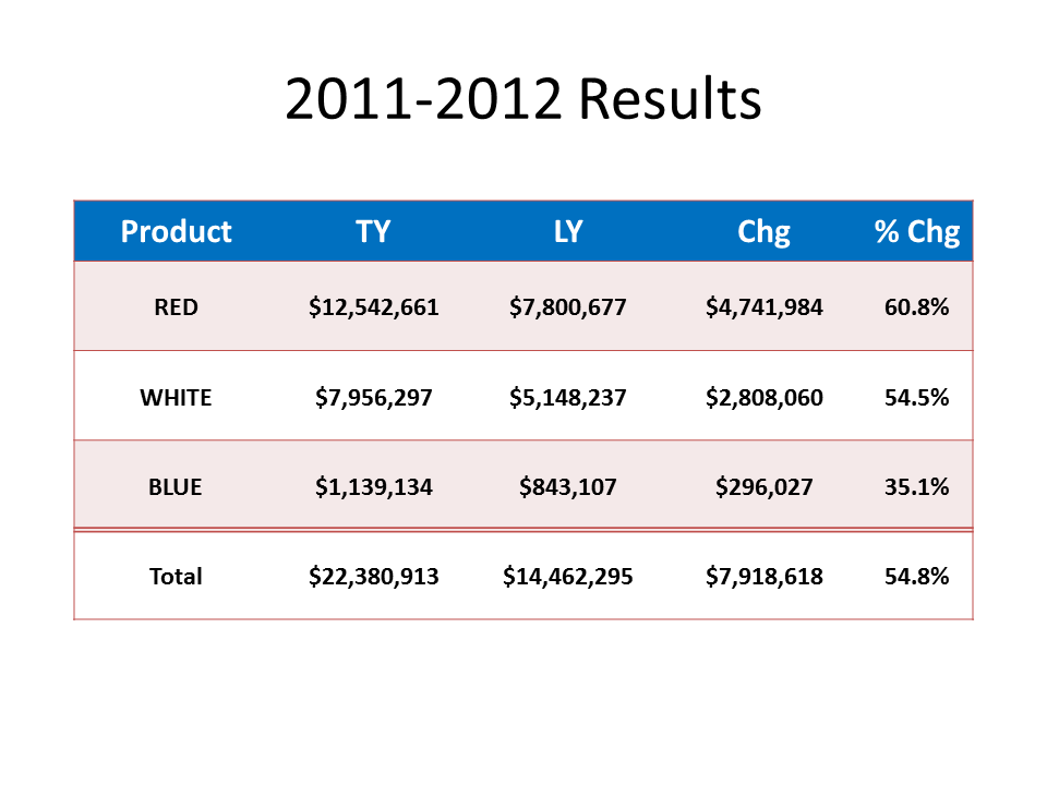
Typically, analysis includes comparing current results to some standard in order to arrive at a conclusion about the performance of a product, group, or territory. It could be comparing current sales to planned sales, current operational productivity to the company goals, or last month’s expenditures to the budget that was approved. Our Excel spreadsheet usually has four columns for each item: the current measured results, the standard we are comparing to, the absolute difference between the results and the standard, and the relative difference expressed as a percentage. When we do a simple copy and paste of these cells, we include numbers that are not relevant to the true message of our analysis.
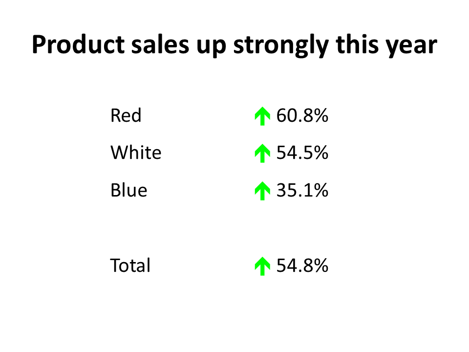
In almost all cases, the audience is most concerned about the performance relative to the standard, the fourth column of our analysis spreadsheet. How did we do compared to what was expected? Were we ahead or behind, and by how much percentage wise? The absolute difference isn’t as helpful because magnitude has to be taken into account. So I suggest that we can eliminate the first three columns, or 75% of the numbers, since they don’t end up helping the audience understand the message.
I also suggest that we can make the percentage difference column more meaningful by adding visual indicators of whether the percentage is above or below the standard and whether that is a positive or negative result (since above standard is not always a good result, especially when it relates to expenditures above budget). I find using the arrow symbols in the Webdings font a good way to add an up or down arrow to a text box or table. You can make the font of the arrow green or red to indicate a good or poor result. And by using a text symbol, it makes it easier to animate the text box.
Here is an example of a slide that had a spreadsheet copied on to it and what the slide looks like when we eliminate 75% of the numbers. Notice how the message is much clearer with less numbers and arrow symbols.
Original slide
Slide with 75% less numbers
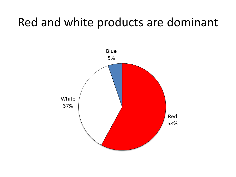
In the above example, some might argue that the split of sales between each of the products is lost when you eliminate the three columns. If you want to make two points from the spreadsheet, I suggest you use two slides. Showing proportions of the total sales between the three products is best done using a pie graph as this example shows.
The next time you want to copy a spreadsheet on to a slide, pause and consider whether you can use these ideas to eliminate 75% of the numbers and make your message clearer for your audience.
First, I’d like to address how this overload of numbers occurs that leads us to having to eliminate 75% of the numbers. There is a lot of analysis that is done in Excel, and we want to include it in our presentations. Excel is the best tool to do the analysis. The problem comes when we go to put that information into a presentation. It is too easy to simply copy the cells from Excel onto a slide. And that is where we end up including more numbers than are needed to communicate the conclusion of our analysis.
Typically, analysis includes comparing current results to some standard in order to arrive at a conclusion about the performance of a product, group, or territory. It could be comparing current sales to planned sales, current operational productivity to the company goals, or last month’s expenditures to the budget that was approved. Our Excel spreadsheet usually has four columns for each item: the current measured results, the standard we are comparing to, the absolute difference between the results and the standard, and the relative difference expressed as a percentage. When we do a simple copy and paste of these cells, we include numbers that are not relevant to the true message of our analysis.
In almost all cases, the audience is most concerned about the performance relative to the standard, the fourth column of our analysis spreadsheet. How did we do compared to what was expected? Were we ahead or behind, and by how much percentage wise? The absolute difference isn’t as helpful because magnitude has to be taken into account. So I suggest that we can eliminate the first three columns, or 75% of the numbers, since they don’t end up helping the audience understand the message.
I also suggest that we can make the percentage difference column more meaningful by adding visual indicators of whether the percentage is above or below the standard and whether that is a positive or negative result (since above standard is not always a good result, especially when it relates to expenditures above budget). I find using the arrow symbols in the Webdings font a good way to add an up or down arrow to a text box or table. You can make the font of the arrow green or red to indicate a good or poor result. And by using a text symbol, it makes it easier to animate the text box.
Here is an example of a slide that had a spreadsheet copied on to it and what the slide looks like when we eliminate 75% of the numbers. Notice how the message is much clearer with less numbers and arrow symbols.
Original slide
Slide with 75% less numbers
In the above example, some might argue that the split of sales between each of the products is lost when you eliminate the three columns. If you want to make two points from the spreadsheet, I suggest you use two slides. Showing proportions of the total sales between the three products is best done using a pie graph as this example shows.
The next time you want to copy a spreadsheet on to a slide, pause and consider whether you can use these ideas to eliminate 75% of the numbers and make your message clearer for your audience.
posted by Unknown at 8:51 AM
0 comments
![]()