Presentation Insight: Are your slides Re-Tweetable?
What does Twitter have to do with effective slides in your PowerPoint presentation? A lot more than you think. This occurred to me last week as I was helping a client prepare a presentation for an upcoming investor conference. Twitter gives us an interesting way to measure how much of an impact a message makes when someone reads it. If they understand and like the message, they retweet it and mark it as a favorite.
So why should this matter to presenters? Because we want the key messages in our presentation to have an immediate impact on our audiences. We want the audience to understand the messages, see how the messages impact their life or business, and act on those messages. Not that much different from what a good tweet does.
So which tweets have the most impact? Those that have effective images attached. This research from Buffer shows that tweets with images received 89% more favorites and were retweeted 150% more than tweets without images. The most retweeted tweet of 2013 (Lea Michelle thanking fans for their support after the death of Cory Monteith), and the most retweeted tweet of all time (US President Barak Obama's re-election in 2012) both contained images. In our presentations, if all we are using is text, we are missing a great opportunity to be memorable. By using visuals, we can increase the impact of our presentation.
But it is not just adding any old image and assuming just the presence of the image will make the presentation better. A random image attached to a poorly structured tweet won't get much attention. There are two parts of effective tweets that presenters can adapt: the well written text tweet, and the interesting, meaningful visual.
On a slide, the equivalent to the text tweet is the slide headline. An effective tweet usually isn't just a topic statement. It explains the key message in 140 characters or less. You can write quite a lot in 140 characters. Don't be afraid to write a longer headline that summarizes the key point you want the audience to understand from your slide. And limit yourself to one key message. Just like on Twitter, if you have another point, you send another tweet. If you have two points to make, use two slides, each with its own headline. The message in the headline should be so important that the viewer wants to see and hear more from you about this point.
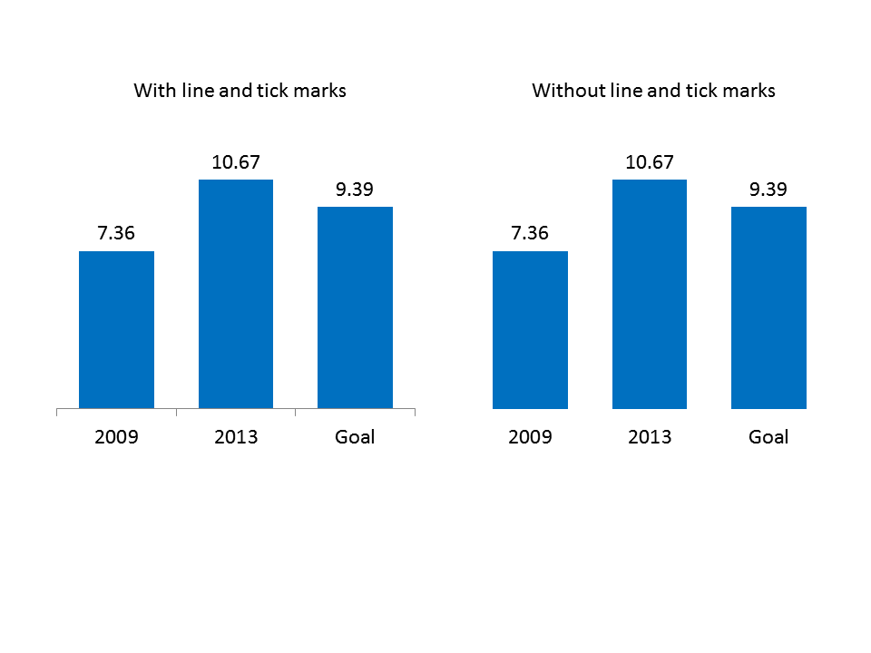
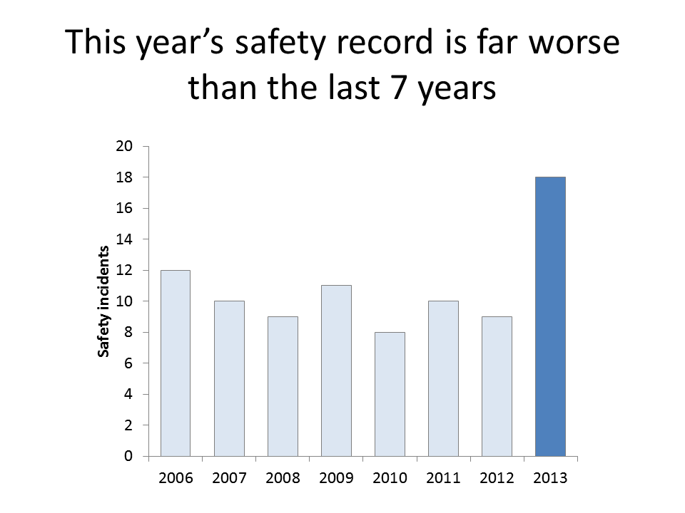
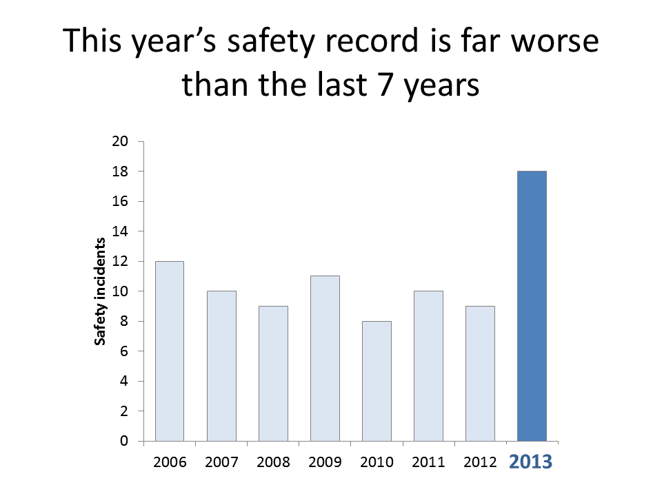
The equivalent to the Twitter picture is a visual on your slide that illustrates the message in the headline. If you are comparing numbers or values, use a graph, proportional object collection, grouped item comparison diagram, or other visual that shows the difference in values. If you are talking about the relationship of events over a time period, use a timeline, Gantt chart, or calendar diagram. There are many other visuals for other types of situations or messages you are communicating. The visual helps solidify the message in the mind of the viewer.
Here is an example of a slide with a clear message in the headline, and a visual that illustrates the point.
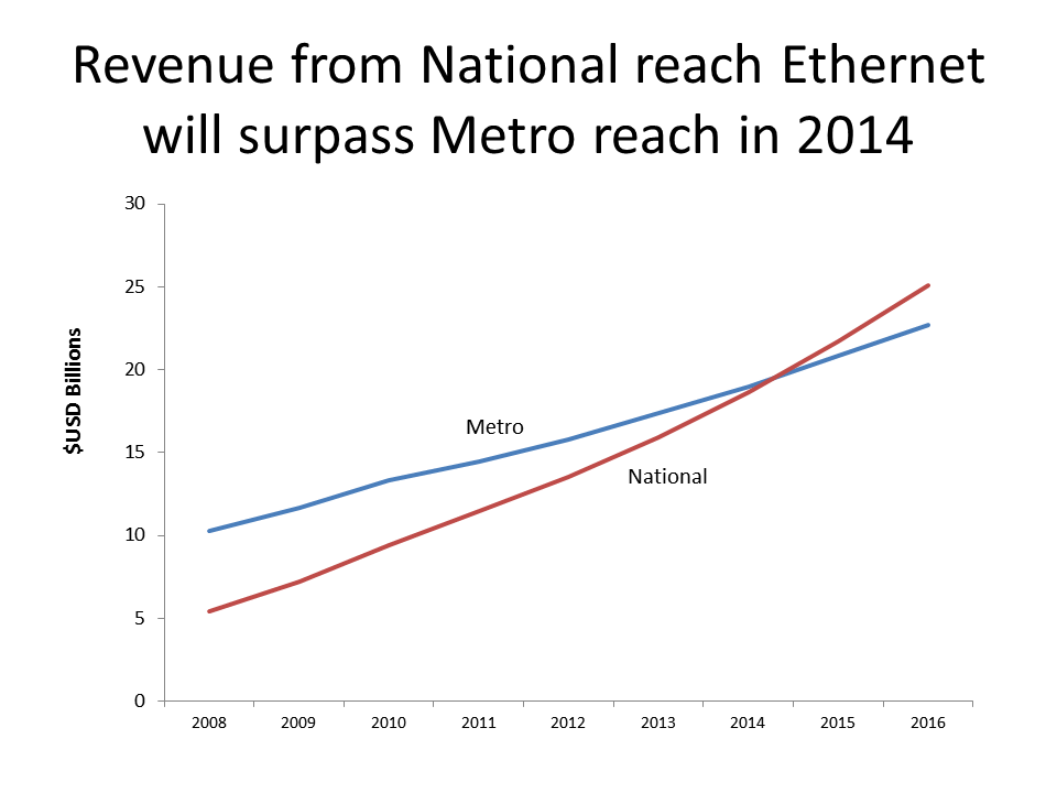
With a clear headline and a meaningful visual, your slide becomes something your audience wants to share with others. Even if you are not on Twitter, if you make your slides Re-Tweetable, you will improve the effectiveness of your presentation.
So why should this matter to presenters? Because we want the key messages in our presentation to have an immediate impact on our audiences. We want the audience to understand the messages, see how the messages impact their life or business, and act on those messages. Not that much different from what a good tweet does.
So which tweets have the most impact? Those that have effective images attached. This research from Buffer shows that tweets with images received 89% more favorites and were retweeted 150% more than tweets without images. The most retweeted tweet of 2013 (Lea Michelle thanking fans for their support after the death of Cory Monteith), and the most retweeted tweet of all time (US President Barak Obama's re-election in 2012) both contained images. In our presentations, if all we are using is text, we are missing a great opportunity to be memorable. By using visuals, we can increase the impact of our presentation.
But it is not just adding any old image and assuming just the presence of the image will make the presentation better. A random image attached to a poorly structured tweet won't get much attention. There are two parts of effective tweets that presenters can adapt: the well written text tweet, and the interesting, meaningful visual.
On a slide, the equivalent to the text tweet is the slide headline. An effective tweet usually isn't just a topic statement. It explains the key message in 140 characters or less. You can write quite a lot in 140 characters. Don't be afraid to write a longer headline that summarizes the key point you want the audience to understand from your slide. And limit yourself to one key message. Just like on Twitter, if you have another point, you send another tweet. If you have two points to make, use two slides, each with its own headline. The message in the headline should be so important that the viewer wants to see and hear more from you about this point.
The equivalent to the Twitter picture is a visual on your slide that illustrates the message in the headline. If you are comparing numbers or values, use a graph, proportional object collection, grouped item comparison diagram, or other visual that shows the difference in values. If you are talking about the relationship of events over a time period, use a timeline, Gantt chart, or calendar diagram. There are many other visuals for other types of situations or messages you are communicating. The visual helps solidify the message in the mind of the viewer.
Here is an example of a slide with a clear message in the headline, and a visual that illustrates the point.
With a clear headline and a meaningful visual, your slide becomes something your audience wants to share with others. Even if you are not on Twitter, if you make your slides Re-Tweetable, you will improve the effectiveness of your presentation.
posted by Unknown at 9:39 AM
1 comments
![]()