Presentation Insight: 3 Tips for making column graphs even clearer
In my workshops, I always recommend creating graphs in PowerPoint rather than copying them from Excel, because they are easier to edit and it avoids some of the problems of the entire spreadsheet being embedded into the PowerPoint file. Unfortunately, when you create a graph in PowerPoint, the default graph contains many distracting elements. In the workshop I show people what to clean up and this video shows you how to do the cleanup in PowerPoint.
In this article I want to take the cleaning up of column graphs further by sharing three ideas based on information fellow PowerPoint MVP Nolan Haims of PresentYourStory.com shared at the Presentation Summit last September.
"Fewer Distracting Pixels"
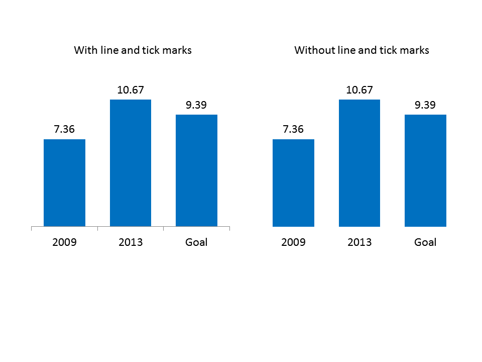
A phrase Nolan used struck me as a guideline for further cleaning up of graphs. He said we should aim to have "fewer distracting pixels" on our slides. He applied the idea by suggesting we remove the tick marks on the horizontal axis for column graphs. The column already shows the audience what label is associated with which data. I would suggest that in many cases we can also remove the axis line, since it often does not add any meaning to the graph. Here is an example of a before and after slide applying this approach. The change isn't much, but it removes pixels that distract the audience from the point of the slide.
Two colors work better than one color for column graphs
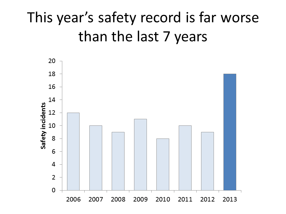
The default graph in PowerPoint assigns the same color for each column in a column graph. I do teach how you can set the color of one column differently than the other columns. The additional nuance I picked up is to apply this more frequently using shades of the same color. Use a muted color for all of the columns except the one or two you want to emphasize. Make those columns a bolder version of that color. By using related colors, the audience knows the data is related, but they also see the difference and will focus more on the columns in the bolder color. Here is an example based on a recent workshop makeover.
Use labels more effectively
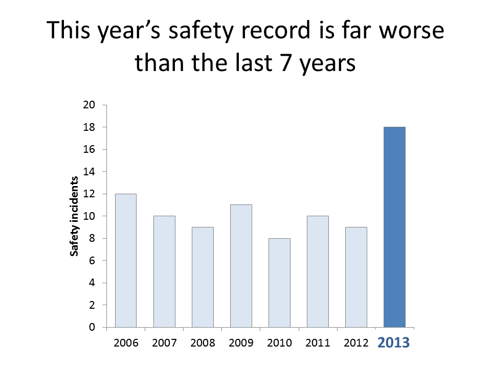
Text labels in the graph allow the audience to quickly understand the point you are making. In my workshops I show how you can add text labels to your graphs if the default data labels won't work for the point you are trying to make. I would now add that you can use labels to better tie the explanatory text to the data by using colors for the text. Here is the example from above with a larger, colored text label placed over the default x-axis label. See how the bold text draws your eye even more to the column you want to emphasize.
While I have explained these ideas in relation to column graphs, you can also apply these concepts to other types of graphs, such as bar charts, pie charts, and line graphs. When presenting numeric information visually, it is important that we make the graphs as clean as possible, to focus as much of the audience's attention on the data that supports our point.
In this article I want to take the cleaning up of column graphs further by sharing three ideas based on information fellow PowerPoint MVP Nolan Haims of PresentYourStory.com shared at the Presentation Summit last September.
"Fewer Distracting Pixels"
A phrase Nolan used struck me as a guideline for further cleaning up of graphs. He said we should aim to have "fewer distracting pixels" on our slides. He applied the idea by suggesting we remove the tick marks on the horizontal axis for column graphs. The column already shows the audience what label is associated with which data. I would suggest that in many cases we can also remove the axis line, since it often does not add any meaning to the graph. Here is an example of a before and after slide applying this approach. The change isn't much, but it removes pixels that distract the audience from the point of the slide.

Two colors work better than one color for column graphs
The default graph in PowerPoint assigns the same color for each column in a column graph. I do teach how you can set the color of one column differently than the other columns. The additional nuance I picked up is to apply this more frequently using shades of the same color. Use a muted color for all of the columns except the one or two you want to emphasize. Make those columns a bolder version of that color. By using related colors, the audience knows the data is related, but they also see the difference and will focus more on the columns in the bolder color. Here is an example based on a recent workshop makeover.

Use labels more effectively
Text labels in the graph allow the audience to quickly understand the point you are making. In my workshops I show how you can add text labels to your graphs if the default data labels won't work for the point you are trying to make. I would now add that you can use labels to better tie the explanatory text to the data by using colors for the text. Here is the example from above with a larger, colored text label placed over the default x-axis label. See how the bold text draws your eye even more to the column you want to emphasize.

While I have explained these ideas in relation to column graphs, you can also apply these concepts to other types of graphs, such as bar charts, pie charts, and line graphs. When presenting numeric information visually, it is important that we make the graphs as clean as possible, to focus as much of the audience's attention on the data that supports our point.

1 Comments:
Hi Dave, thanks for the article. Before-after diagrams always help for easy comprehension.
Post a Comment
<< Home